Google Ads · Landing pages
10 landing page mistakes that waste your Google Ads budget
Your ads get clicks but no enquiries? In most accounts the problem isn't the campaign. It's what happens after the click.

In this article
Quick answer
The landing page mistakes that waste the most Google Ads budget are a page that doesn't deliver what the ad promised, slow loading on mobile, a hidden value proposition and a confusing path to contact or purchase.
You pay for every click. If the page doesn't turn that click into a message, call, booking or sale, Google Ads looks expensive when the leak is actually on the website. And Google notices: landing page experience is one of the three components of Quality Score, the diagnostic that compares your page with those of competitors showing up for the same search.
Below are the 10 mistakes we find most often in the accounts of local businesses and online shops, split into three moments: before the click, on the page and after the click.
Part 1
Before the click: do the ad and the page speak the same language?
Someone who clicks a Google Ads ad has already told you what they want. The first three mistakes happen when the page ignores that information.
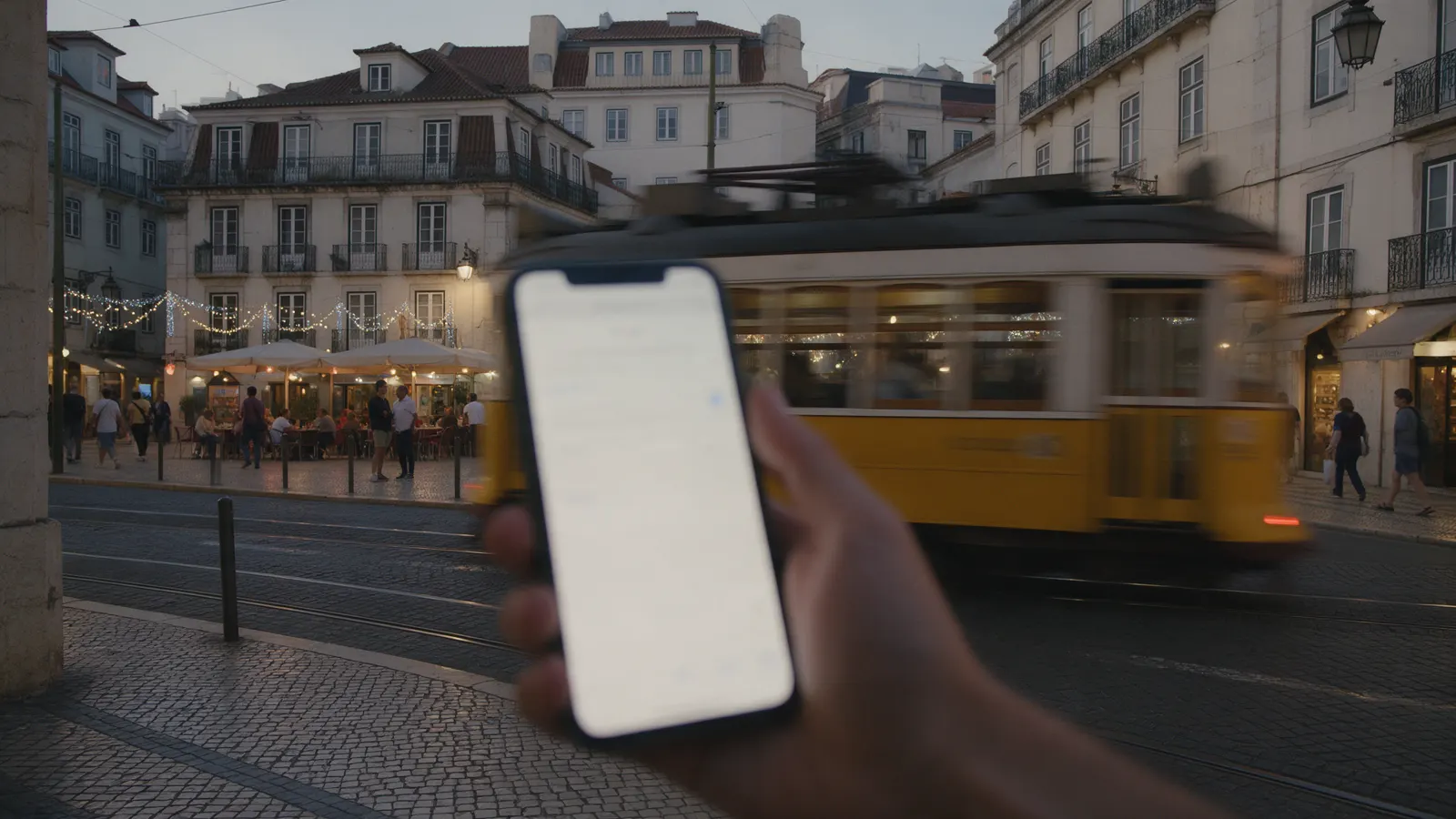
01The page doesn't deliver what the ad promised
Someone searches "Sunday brunch in Lisbon", clicks an ad about brunch and lands on the restaurant's homepage, showing the dinner menu. They had already made up their mind and now have to search again. Often they simply go back to Google and click a competitor.
How to spot it
- Sort the search terms report by cost and visit the page for the most expensive terms.
- Add the "Landing page experience" column and look into anything marked "Below average".
- In Performance Max, check where final URL expansion is sending people.
How to fix it
- The page headline repeats the search intent, using the ad's wording.
- The ad's offer appears on the first screen, without scrolling.
- Exclude URLs that make no sense as a destination from Performance Max.
02All traffic goes to the homepage
The homepage talks about everything, so it answers nothing in particular. A clinic advertising "dental implants" that sends people to its homepage forces them to find the treatment, the price and the booking button on their own.
How to spot it
Cross check your most expensive search terms against the URLs receiving that traffic. A specific search landing on a generic page is a red flag.
How to fix it
- A search for a service goes to that service's page.
- If the page doesn't exist, create a dedicated landing page.
- Keep the homepage for searches for your brand name.
03One page for different audiences
Someone searching "emergency dentist near me" on Google is ready to call. Someone who sees your Meta Ads ad while scrolling Instagram didn't even know they needed you. Sending both to the same page wastes the work of splitting the campaigns.
How to spot it
Compare the same page's conversion rate by channel: Google Ads search, Meta Ads, YouTube. Big differences show it works well for one audience and poorly for the other.
How to fix it
- Warm traffic (Google): short path, contact right at the top.
- Cold traffic (Meta Ads, YouTube): more context and proof before asking for contact.
- Test one version of the page for each type of audience.
Part 2
On the page: do people understand it and can they act?
The person has arrived in the right place. Now the page has a few seconds to explain what it offers and make the next step obvious.
04The value proposition is hidden
A beautiful photo and a headline like "Flavour that inspires" say nothing. "Full Sunday brunch for €18, book on WhatsApp" says what it is, what it costs and what to do. On mobile, a whole first screen spent on branding is a wasted paid click.
How to spot it
Open the page on your phone and look only at the first screen. Show it for five seconds to someone who doesn't know the business and ask what it sells.
How to fix it
- A headline focused on the result the customer wants, not on a slogan.
- Right after it, quick proof: your Google rating or number of reviews.
- Main button visible without scrolling.
05The page is slow to load
Sites with years of plugins, background videos and heavy photos feel fast in the office and crawl on 4G. To measure it objectively, Google uses Core Web Vitals.
Maximum thresholds Google recommends for a good experience.
How to spot it
Test the pages that receive ads in PageSpeed Insights, on the mobile version. Look at real user data first.
How to fix it
- Compress images and use light formats such as WebP.
- Remove plugins, chats and scripts nobody uses.
- Load secondary widgets only after the main content.
06On mobile, buying or contacting you is hard
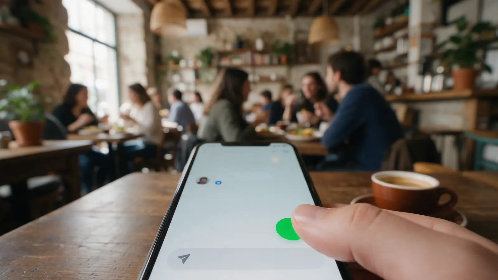
A good share of Google Ads clicks and the vast majority of Meta Ads clicks come from mobile. Even so, many pages were designed on a computer: the WhatsApp button is hidden, the form asks for ten fields, the phone number isn't clickable.
How to spot it
Compare conversion rate by device in Google Ads. Then try to get in touch using only one hand, as a customer would on the metro.
How to fix it
- A fixed WhatsApp or call button, within thumb's reach.
- A minimal form: name, contact and one question at most.
- No windows covering the page in the first few seconds.
07The copy talks about features, not results
"State of the art equipment" convinces nobody. "Whitening in one session, no sensitivity afterwards" does. And with more and more websites written generically, copy that could belong to any competitor goes unnoticed.
How to spot it
Remove your brand name from the copy. If it still works for the competitor down the street, it's generic.
How to fix it
- Link each feature to the benefit it brings the customer.
- Use the words customers use in their Google reviews.
- Test the new copy on the page with the most traffic first.
Part 3
After the click: does the contact happen, and is it measured?
The most expensive leaks appear when the person already wanted to buy or book and something along the way made them give up. Or when the sale happens, but Google Ads never finds out.
08Unanswered questions next to the button
Changing the button colour rarely helps. What stops people is the question that comes up at the moment of decision: how much does it cost, is there parking, can I cancel, do you deliver to my area. And the reviews that answer this are usually in the footer, where almost nobody gets to.
How to spot it
List the questions customers ask most on WhatsApp and by phone before going ahead. Check whether the area around the main button answers them.
How to fix it
- One line next to the button that answers the biggest objection.
- Google rating and number of reviews next to the price.
- Specific testimonials close to the part of the page they refer to.
09Friction in contact or checkout
The person tapped WhatsApp and nobody replied for three hours. Or they reached checkout and found shipping costs they weren't expecting. Or they had to create an account to buy just once. You paid for the click and lost the customer at the last step.
How to spot it
Go through the whole journey as a customer, from the ad to the message or payment, and note every surprise and every wait. For an online shop, check in GA4 where the biggest funnel drop is.
How to fix it
- Show shipping, fees and conditions before checkout.
- Allow guest checkout, with MB WAY or Apple Pay.
- Set a maximum response time on WhatsApp.
10Conversions are measured incorrectly
Some accounts look profitable until someone compares what Google Ads reports with what actually came in. WhatsApp clicks counted as sales, duplicate purchases, spam forms: with the wrong data, the algorithm optimises for the wrong thing.
How to spot it
Compare Google Ads and Meta Ads conversions with real enquiries and sales over the same period. A big gap calls for a review before any other change.
How to fix it
- Primary conversion = purchase, booking or qualified enquiry.
- A unique ID per purchase to avoid duplicates.
- In tests, wait for enough traffic before picking a winner.
Quick test: does your landing page pass in 3 minutes?
If you don't have time to review all 10 mistakes now, start with these three tests. They catch most problems.
- The ad next to the page. Open your highest spending ad and the page it leads to. Does the promise show up within five seconds?
- Your phone in one hand. On mobile data, try sending a message or buying using only your thumb. Note what was slow or annoying.
- The real numbers. Compare last month's conversions with the enquiries and sales that actually came in. If they don't match, fix measurement first.
Frequently asked questions
What is a landing page for Google Ads?
It's the page people land on after clicking your ad. A good Google Ads landing page repeats the ad's promise, explains the offer on the first screen and has one clear next step: send a message, call, book or buy.
Why does my Google Ads campaign get clicks but no enquiries?
Almost always, the problem is the page, not the campaign. Check in this order: whether the page delivers what the ad promised, whether it works well on mobile and whether the path to contact is short. Fix the biggest problem first.
What does "landing page experience below average" mean?
It means Google considers your page less relevant or useful than those of competitors showing up for the same search over the last 90 days. The most common cause is a page that doesn't match what the person searched for.
Can I send Google Ads traffic to my homepage or to Instagram?
Usually not. The homepage only works for searches for your brand name, and Instagram adds one more step before contact. For searches for a service, use a specific page with a direct contact button.
Should my Google Ads landing page be the same as my Meta Ads one?
Not always. People coming from Google Ads are already searching and want a short path. People coming from Meta Ads were interrupted in their feed and need more context and proof before getting in touch.
Sources: Google Ads Help, Quality Score · web.dev, Core Web Vitals